MMMMM.
MMMMM.
STUDIO
STUDIO
Dead Good
Dead Good
Dead Good
Client
Client
Client
Dead Good
Service
Service
Service
Brand Identity

The ask
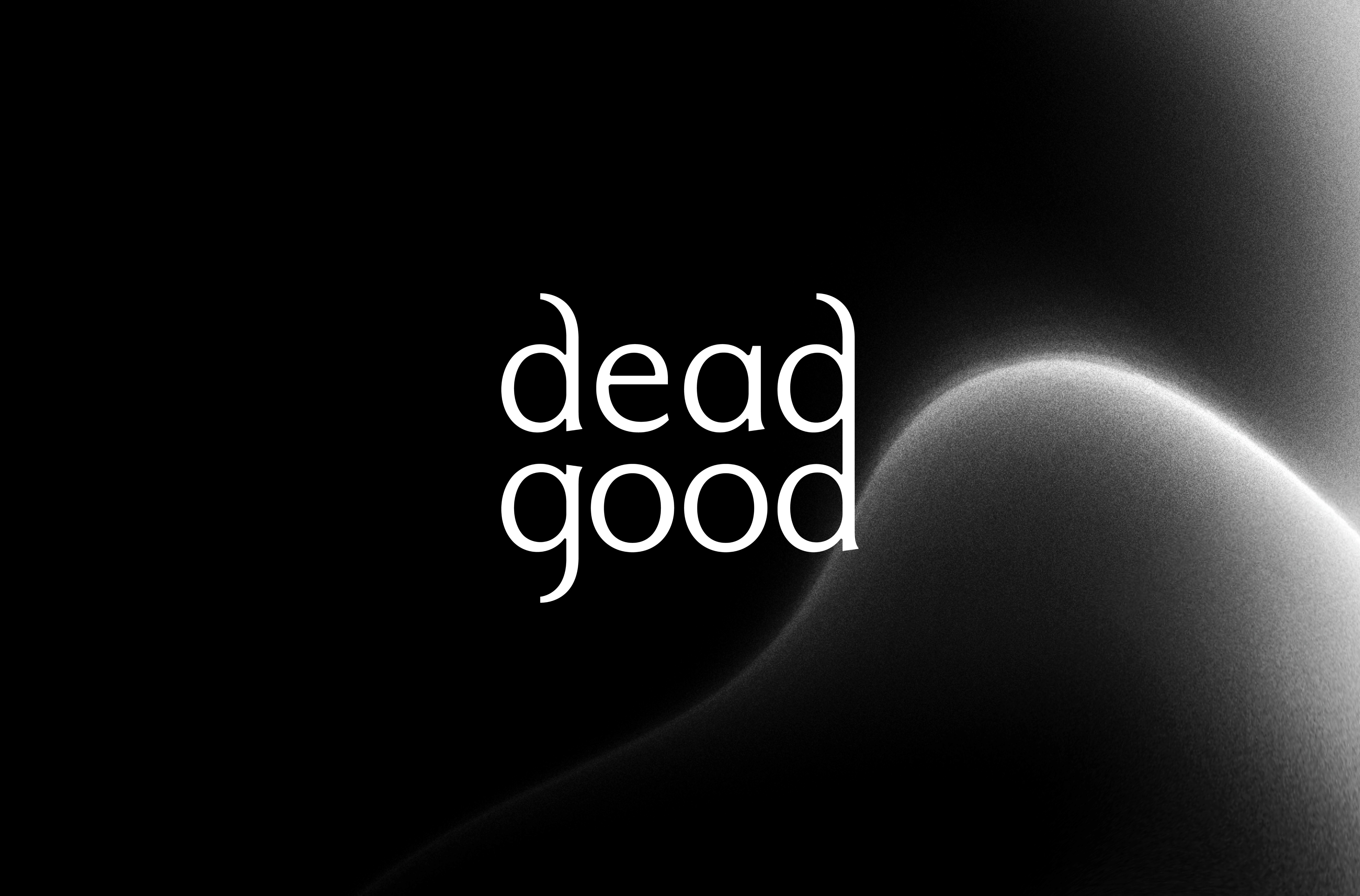
Dead Good's name itself is a striking combination of concepts: 'Dead' and 'Good'. Far from suggesting a simple contrast between negatives and positives, this duality is at the heart of what Dead Good aims to convey—a breakthrough from conventional thinking, a bridge between varied cultures, and the sharing of universal values and ideas.
But how do you get the creatives to notice?
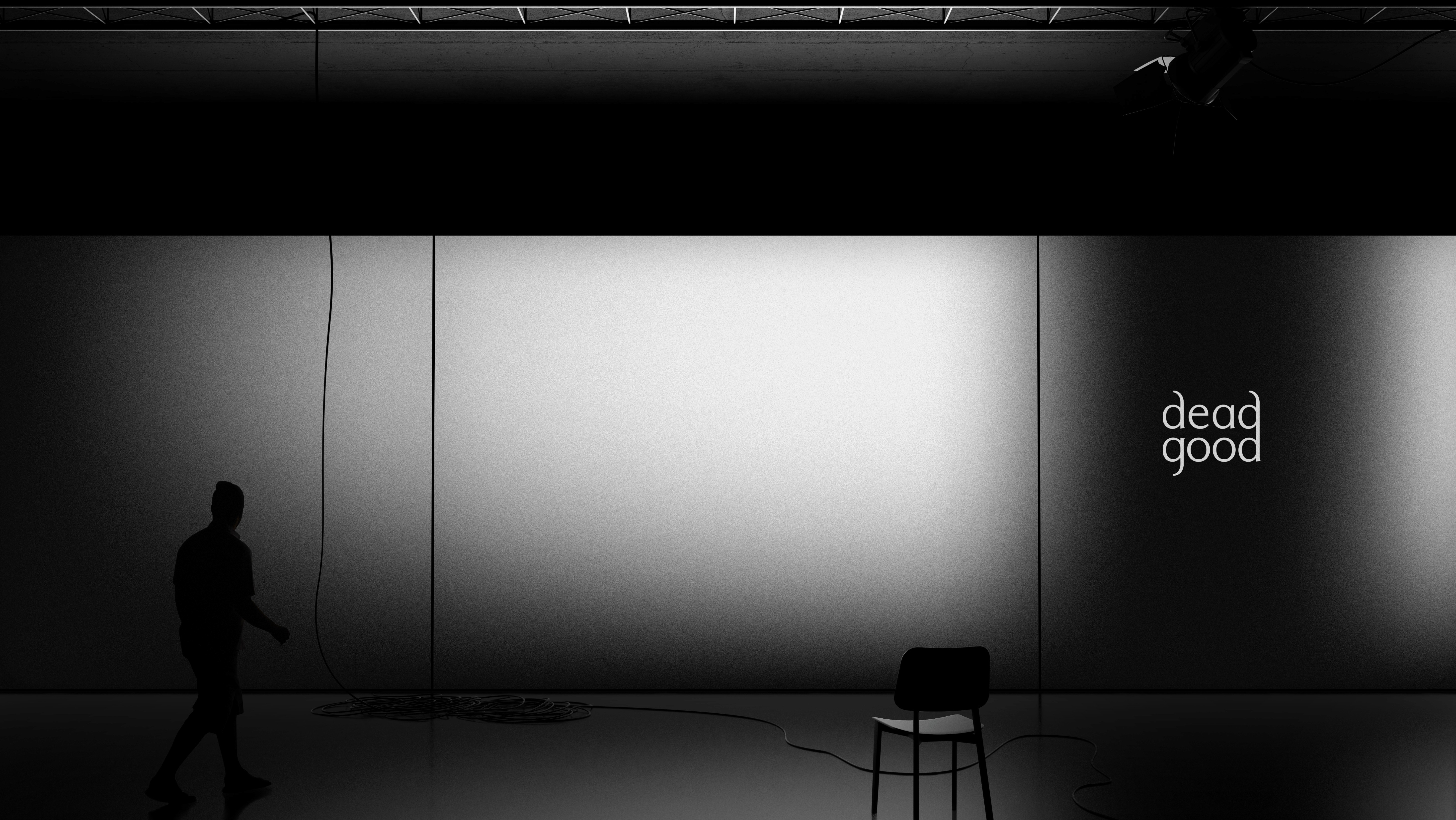
We capture this essence through the interplay of black and white, a nod to the name's inherent contrasts. By transcending binary oppositions with soft, glowing light leaks, this fusion not only allows the content to be the focus but also imparts a sense of timelessness and boundlessness. It's a visual metaphor for a journey into the unknown, encouraging deeper understanding and introspection.
